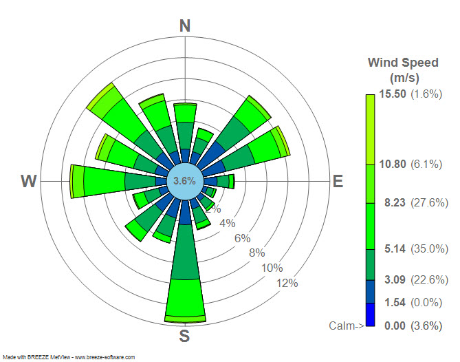
A windrose is used mostly by meteorologist. It helps to tell them the wind speed and direction of a weather pattern in an area.
http://upload.wikimedia.org/wikipedia/commons/7/70/Wind_rose_plot.jpg

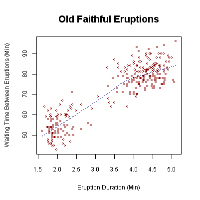 A scatterplot is used to show the results of data using 2 variables. A trend line is usually drawn to try and make the data a little easier to explain.
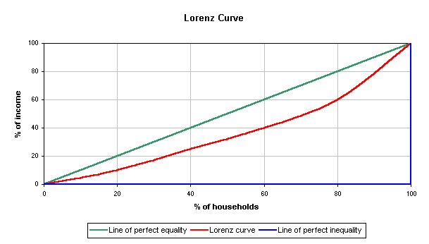 It is used by many economists to explain wealth and social inequality. It can be used to show what proportion of the households hold what percent of the wealth.
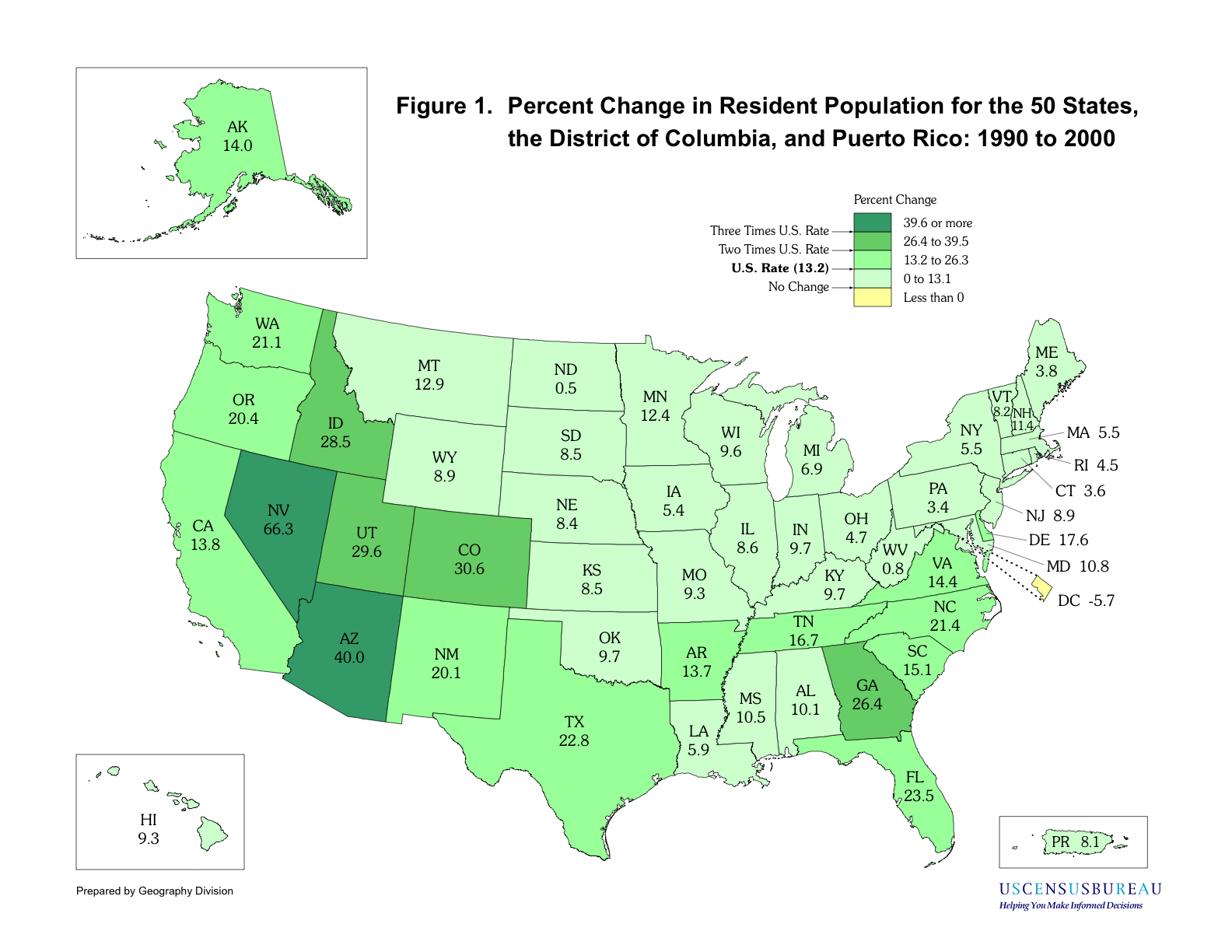
 This map shows the distribution of cervical cancer among women in areas. The brighter the color the more cases.