Friday, December 4, 2009

Correlation Matrix.


This is a matrix that shows the correlation of a certain amount of variables. This specific matrix uses colors to show the correlation. The more red the higher the correlation and the more blue the lower the correlation.

http://yin.che.wisc.edu/images/ProteinMatrix.jpg

Star Plots


A star plot shows data in a two dimensional chart. It has 3 or more variables. This specific plot has 7 variables and 4 designs that it is comparing.

http://upload.wikimedia.org/wikipedia/commons/0/09/MER_Star_Plot.gif

Similarity Matrix


This matrix is used to show how strongly correlated or similar two things are to each other. Closer to red the more similar and the closer to blue the less similar.

http://www.fxpal.com/systems/MediaAnalysis/sim10000.gif

Index Value Plot


This index value plot helps show the average streamflow in NC. It shows the years and the degree of dry to wet.

http://waterwatch.usgs.gov/regplots/real/real_nc_2.gif

Thematic Maps


This type of map shows specific things in specific regions using colors. It can be used for many different things such as weather, rainfall, political parties, and population. In this case it is the soil moisture regimes of the US.

http://soils.usda.gov/use/thematic/images/drought_1_gen_area_map.jpg

Stem and Leaf plot


This shows quantitative data in a simpler form, a plot chart. It can be used to show almost anything, in this case it is infant mortality rates in western Africa.

http://mainland.cctt.org/mathsummer/JosephBond/StemAndPlots/images/table2.gif

Box Plot


A box plot is used to show numerical data. It uses 5 different observations, minimum, maximum, lower quartile, median, upper quartile. This plot shows the spread of light among 5 separate experiments.

http://upload.wikimedia.org/wikipedia/commons/f/fa/Michelsonmorley-boxplot.svg

Histogram

A histogram is used to show how many of something fall into a certain group or category. In the graph above it shows the frequency of the heights of black cherry trees.


http://upload.wikimedia.org/wikipedia/commons/d/d9/Black_cherry_tree_histogram.svg

Parallel coordinate graph


This graph puts all findings on one graph. To avoid confusion it uses different colors to represent different findings and variables.

http://bdtnp.lbl.gov/Fly-Net/content/bid/pcx/ParallelCoordinates/ParallelCoordinate_MainGUI.png

Triangular Plot


A triangular plot uses an equilateral triangle to show data from 3 different variables. All three variable usually add up to 100% of the data.

http://upload.wikimedia.org/wikipedia/commons/2/24/Flammability_diagram_methane.png

Windrose


A windrose is used mostly by meteorologist. It helps to tell them the wind speed and direction of a weather pattern in an area.

http://upload.wikimedia.org/wikipedia/commons/7/70/Wind_rose_plot.jpg

Climograph


A climograph is a graph that shows the rainfall and temperature of a specific region over the course of a certain time period and for a certain place.


http://arsc.arid.arizona.edu/migratory/case_studies/mazatlan-climograph.jpg

Population Profile


This map shows the percent change in population in each of the 50 states. The darker the shade of then the higher the percent change.


http://upload.wikimedia.org/wikipedia/commons/d/d4/2000-census-percent-change.png

Scatterplot

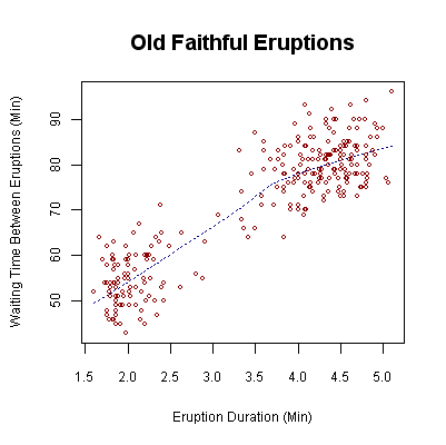
A scatterplot is used to show the results of data using 2 variables. A trend line is usually drawn to try and make the data a little easier to explain.

http://upload.wikimedia.org/wikipedia/commons/0/0f/Oldfaithful3.png

Lorenz curve

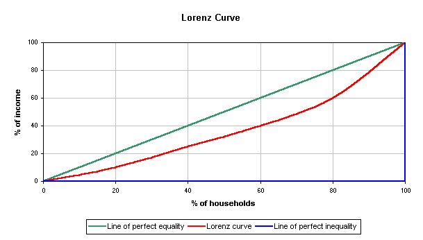
It is used by many economists to explain wealth and social inequality. It can be used to show what proportion of the households hold what percent of the wealth.

http://upload.wikimedia.org/wikipedia/commons/b/bd/Lorenz-curve1.png

Bilateral graph


A bilateral graph uses 2 or more variables and shows their overlap. If you add all of the variables together they will equal the whole in each year. In this graph it shows what happened to all of the trainees and experts in this specific company.

http://www.mofa.go.jp/policy/oda/category/environment/pamph/2001/image/1_3.gif

Standardized choropleth map

This map shows the distribution of cervical cancer among women in areas. The brighter the color the more cases.

http://www.geovista.psu.edu/VIT/images/cervicalCancer_valueByAlpha.jpg

Bivariate choropleth map

This map type uses 2 variables on one map. In this example it uses life expectancy and GDP per capita. It also shows a correlation between the two.

https://blogger.googleusercontent.com/img/b/R29vZ2xl/AVvXsEjWo-9sYu8m7osmCKJQJQ9lC0upgIQyonWWFi7TBJ3r37LqbvMmSpCKBKsOGK2ny0p17CNDF4DN3MFWP6lsld0avLyDksJny3LqGpFYOoY405RnwLHZ2ivC9z4YNdpGProkJXADhyphenhyphen3FEljv/s400/bivariate+choropleth+map.jpg

Unclassed choropleth maps

The unclassed choropath map changes the distribution numbers into colors. In this case the darker the color the denser the population. The lighter the color, the less dense the population.


http://www.agocg.ac.uk/reports/visual/casestud/dykes/figure9.gif

Classed choropleth maps


A classed choropath map uses colors with varying darkness to display certain number ranges. In this case it uses different shades of green to show the hispanic population distribution.
https://blogger.googleusercontent.com/img/b/R29vZ2xl/AVvXsEgNyhRagNi4DAMfgt7lAzdaz06qgqTxY6gDdVwZkXabhy5nodcpDUPu1he8vKaWuYxKoU9wxIZAuROGpJtkAyI_KZzRUmktFOWKb3jtB_vxu-_sVHV5h2zYZpylwayyXOV10EbyZJzOmbk/s320/classed+choropleth+map.gif

Range graded proportional circle map


This map uses circles to show greater and lesser values of something in a certain ares. This map shows if certain parts of the country are navigable by boat, canoe, or non-navigable.

http://
pubs.usgs.gov/fs/fs-004-03/images/fig5lg.gif

Continuously variable proportional circle map

This shows the population in certain cities. The larger the circle, the higher the population, the smaller the circle, the lower the population.

http://www.neiu.edu/~smkope/387/BasicPage/Proportional%20Circle%20Map.jpg

DOQQ


A DOQQ stands for Digital Orthophoto Quarter Quadrangle. It is an overhead shot of an area.

http://upload.wikimedia.org/wikipedia/en/1/1f/DOQQ.jpg

DEM


DEM stands for digital elevation model. It is a digital representation of terrain.
http://upload.wikimedia.org/wikipedia/commons/f/ff/Mtm-05277e_3d.png

DLG


DLG stands for Digital Line Graph. The DLG offers nine different layers when producing a DLG map.
http://upload.wikimedia.org/wikipedia/commons/5/51/Susq_sub.png

DRG


DRG stand for Digital Raster Graphic. A topographic map os scanned into a computer and the DRG examines it to create a digital image.

http://upload.wikimedia.org/wikipedia/commons/7/79/Topographic_map_example.png

Isopleths

An isopleth map simplifies data by correlating a number to a color in this instance. The darker the color the higher the number.

Isopach


This map shows the thickness of sediment deposits by a flood. It also uses colors to show different levels of thickness. The darker the color, the thicker the sediment.

Isohyets


This type of map shows estimated or predicted amount of rainfall in an area. It uses colors to show the areas that it expects to get more rain.

http://www.forest.sabah.gov.my/caims/Climatic%20information/Stations/Maps/Isohyet/isohyet.gif

Isotachs

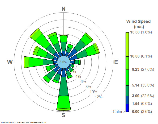
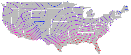
This map is used to show the speed of the wind in areas. The darker the color, the faster the wind speed.

http://www4.ncsu.edu/~nwsfo/storage/cases/20030123/small.eta_12z_300_000hr.gif

Isobars


This map shows the air pressure in an area. When the lines are closer together, that means that the pressure will be higher and when the lines are farther apart the pressure will be lower.

http://www.newmediastudio.org/DataDiscovery/Hurr_ED_Center/Hurr_Structure_Energetics/Closed_Isobars/Closed_Isobars_fig02.jpg

LIDAR


LIDAR stands for Light Detection and Ranging. It can figure out the distance of an object to the surface that it is on.

http://www.noaanews.noaa.gov/stories/images/manhattan-lidar092701.jpg

Doppler Radar


Doppler Radar is used by meteorologists. It sends a wave to a object and examines how it reflects and it is able to show the weather patterns this way.

http://www.weatherusa.net/blog/images/doppler-orlando-1943.gif

Black and white aerial photo


This map is simply a black and white photo from straight above an area. Because the photo is in black and white it can easily show different types of areas such as desert or forrest.

http://freegeographytools.com/wp-content/uploads/2007/09/doq-thumb.jpg

Infrared aerial photo


This type of map uses infrared to help show the difference between land, water, desert, forest, and other types of land. If this photo was taken without infrared the water would be much more difficult to tell.

http://www.aerialarchives.com/imagedb/IR0010154f.jpg

Cartographic animations


This maps use color lines and animations to show you things, such as dips in the mountain, that would not be so obvious without the lines. It uses different colors to show different areas.

http://www.wiu.edu/users/cre111/older/CGFinal/allpathb.jpg

Statistical Maps


This map uses numbers on the states to show the number of property losses to due floods. It also uses colors to show immediately, which states have higher numbers.


http://slabbed.files.wordpress.com/2008/04/totclaims2005sm.gif

Cartograms


These types of map alter the shape of the country based on the population of the area. This makes makes the countries wider that have a larger population.

http://www.ribbonfarm.com/wp-content/uploads/2007/07/population800x400.png

Flow Map


A flow map is used to show how traffic flows. It can be used for water, roads, trains, anything that has a flow of traffic.
http://upload.wikimedia.org/wikipedia/commons/6/62/Minard’s_map_of_French_wine_exports_for_1864.jpg

Isoline Map


This map shows the differences between potential temperatures in areas. It is used a lot by meteorologists.

http://indiemaps.com/images/isolineFinished.png

Proportional Circle Map


This map type shows the frequency of something using circles. The larger the circle, the more frequent the event. In this specific map it shows you the number of mexicans moving to a certain area.


http://www.neiu.edu/~jrthomas/377/circle.jpg

Choropleth Map


THis type of map shows the different divorce rates in states by color. The darker the color the higher the increase in divorce rates.

http://www.pop.psu.edu/images/gia/maps/changeanim.gif

Dot Distribution Map


A dot distribution map shows where something is most likely to occur, such as areas being populated as in the map above. The more dots the higher the population.

http://www.census.gov/geo/www/mapGallery/images/small2kden.jpg

Hypsometric Map


A hypsometric map is one that tells altitude and height by varying colors. In this map it shows the higher altitudes with red.

http://www.scilands.de/service/downloads/geschummerte_karten/hillshade_greece.jpg

Propaganda Map


A propaganda map is used by a group of people or government to try and further their cause. It can show other nations in a negative light and their nation in a good light. They are used to attack other nations or groups of people and to persuade people.

http://upload.wikimedia.org/wikipedia/commons/6/67/Alaskadeathtrapa.jpg

PLSS Map


PLSS stands for public land survey system. It is used to map out ownership of land in America. It is mostly used in more rural areas where the property lines can become a little fuzzy.

http://upload.wikimedia.org/wikipedia/commons/8/83/Meridians-baselines.png

Cadastral Map


This type of map uses lines to show the extent of property in a certain area. In this specific map it is showing the property lines in a community.

http://balloonaerialphoto.com/images/cadastral_thumb.jpg

Topographic Map

A topographic map is very detailed. It usually uses different colors to show different land types such as mountain vs. flat land.

http://upload.wikimedia.org/wikipedia/commons/7/79/Topographic_map_example.png

Planimetric Map


A planimetric map only represents the horizontal aspects. It does not show height or depth.

http://www.bestcountryreports.com/media/D_Images/France_Pol2.jpg

Mental Maps

A mental map is a map of how a person actually views the area. It can be different than how things really are or just highlight specific things that help that person remember the area.